A Roomy Bathroom Finds Its Functionality
Many design dilemmas are caused by not having a large enough space for the desired layout—but that’s not always the case. Sometimes, the opposite is true—and an overly large floorplan makes for an awkward, or un-intuitive, design. Such was the case for a retired couple in St. Alban’s, near Franklin County, Missouri. Their master bathroom was high on square footage, but low on functionality—so they turned to Aptitude Design and Build for a remodel that would fit their changing lifestyle and make better use of their home’s advantages. “It was a big bathroom that just seemed like a lot of unused space. It wasn't thought out very well, as far as the layout,” recalls Aptitude President Matt Mierek.
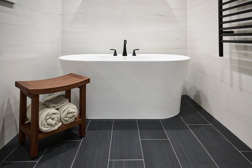
The first order of business was to bring in elements that would make better use of the square footage at their disposal. On the homeowner’s wish list? A specialized soaking tub. “It’s a microbubble tub,” explains Mierek. “Instead of a whirlpool tub where you have jets, a microbubble tub creates microscopic bubbles.” These bubbles detoxify and gently exfoliate the skin, leading to a smoother, softer appearance and feel which can be especially beneficial for those with skin concerns. For the homeowners, this health and beauty technology seemed like a perfect way to treat themselves in their golden years. “It's a lot more delicate on the body, and it does a totally different thing than what a jetted tub would do,” Mierek says.
A walk-in shower was another request to suit the couple’s needs. “Being an older couple that’s aging in place, we did a zero-entry shower,” recalls Mierek. “You can see that the floor of the bathroom goes right into the shower. It’s a cool design, and it’s also very functional in that, when you are thinking of these things for the future, you don't have to lift your foot (or a walker) over a shower curb.” The shower itself is spacious, but the design details make it highly functional as well. “This shower is really big—and that's one of the reasons we included a separate handheld showerhead, because the mounted showerhead on the opposite wall is so far away.” A waterfall mosaic accent helps break up the expanse of tile in the space, and acts as a focal point that can be seen from the moment you enter the bathroom. “We specifically put that in a spot where, when you're walking into the shower, you see that centered right in that doorway,” Mierek explains.
With the new floorplan created to accommodate the soaking tub and a new double vanity, Mierek moved on to find new ways to maximize the leftover square footage. “We were left with this corner spot, so we decided to do some glass shelving,” he says. A linen closet was built to the left of the shower entry, a thoughtful addition that keeps things organized and close-at-hand. The final touch? Integrated lighting in the vanity mirrors, to allow for a clean, seamless design—and to help the homeowners look their best at any age.
Client:
Craig and Sue
Location:
St. Albans
Type:
Size:
190
CLIENTS


